I knew when I started this blog that it would be tough to post with any type of regularity, but I didn’t think it would get this bad. Sorry about that. I’m going to start making some smaller posts with more frequency in addition to the longer ones I typically write. If you’re on Twitter, you can follow me at @SportDesignBlog for more regular links and comments.
Onto the content…
Several Major League Baseball teams announced new uniforms recently, and a few paired their new threads with new logos. Here’s a look at each, in order of their announcement.
San Diego Padres

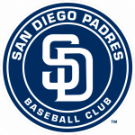 The Padres appear to have made an attempt at the “modern take on vintage” trend with their new logo, but it just came out boring. They reused their interlocking SD mark, which they updated a few years ago – and I like it – but simply placing it in a plain circle with plain type around it makes for a boring logo.
The uniforms, while not ugly, are also boring. Stripping away any sort of third color made everything white and navy, which in baseball may be traditional, but it’s still boring.
Miami Marlins
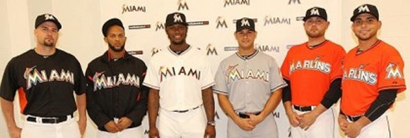
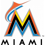 On the opposite end of the spectrum, we have the newly-renamed Miami Marlins. Their logo and uniforms are far from boring. They’ve certainly tried to show the colorful nature of Miami through their new identity. When it was first released, I thought it was terrible. I still don’t like it, but it’s grown on me. It’s so different from other baseball identities that it bothered me at first, but now I’m not so sure that’s a bad thing.
The thing that still bothers me is the lack of attention to detail. For example, why is the marlin on the logo coming awkwardly out of the front of the “M” and jumping behind it? It would make much more sense and look much better if it was coming from behind it into the foreground. Also, with the wordmark on the uniforms – especially the white ones – it bothers me how much bolder the “M” appears than the rest of the word. And on the orange alternates, why is the marlin randomly jumping out from between the “L” and the “I?”
Overall, while not great, at least the Marlins are trying something different in the baseball world. Boy, is that orange bright, though…
Baltimore Orioles
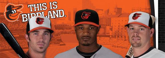
Another team bringing back part of their past is the Baltimore Orioles. They’ve brought back a slightly updated cartoon bird logo on their hats. It’s nice to see these vintage logos making a comeback for the nostalgia, but in terms of being a good logo, is a smiling cartoon bird really a good sports logo? It seems to get a pass in baseball because of the history. It is more interesting than a script “O” or this bird, though.
New York Mets
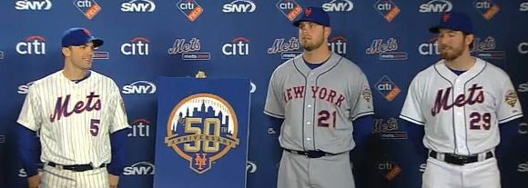
The New York Mets’ change is a minor one, but one a lot of people are excited about. The Mets are finally ditching the black – all of it. No more black drop shadows, no more black alternate jersey, no more black hat. No more black.
Toronto Blue Jays
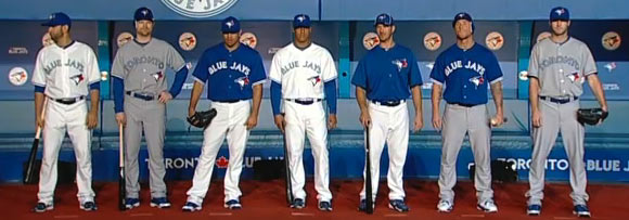
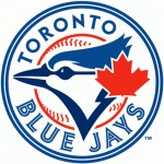 After the Marlins, the Toronto Blue Jays’ new look has probably been the most talked about. And definitely the most liked. Are you seeing the trend of a modern take on vintage? The Blue Jays brought back their old logo with some updates. The blue jay is a lot sleeker than the old one, and the colors are better. The baseball illustration is better, and the double circle around it all gives it a nice, defined shape. But I don’t think everything is better this time around.
The old type was much better in my opinion. I love that they brought back the split-style type, but I’m not keen on the new typeface. It seems like an oddly-used engravers’ typeface, like Copperplate. The old type was unique and interesting. And the fact that “Toronto” doesn’t have the center lines is odd.
The other thing that I don’t like about the new logo is the placement of the maple leaf. First of all, I don’t understand why just because a team is Canadian, they need to have a maple leaf in their logo, but secondly, if they must, why doesn’t it come nicely out of the baseball line like the old version?
The uniforms followed suit by going throwback. Only this time no baby blue. The only complaints I have here are the inconsistency of now deciding to use split-style type for “Toronto” and that the blue jay is so low on the front of the uniforms. Though I don’t know where else it would go.
The Kansas City Royals, Cleveland Indians, and San Francisco Giants all announced changes to their uniforms as well, even more minor than the Mets’ (at least in terms of fanfare). As usual, thanks to sportslogos.net for most of the logos and images.
What do you guys think of these redesigns?


